
Table of Contents
Visual Portfolio → Settings → Images.
Lazy Loading
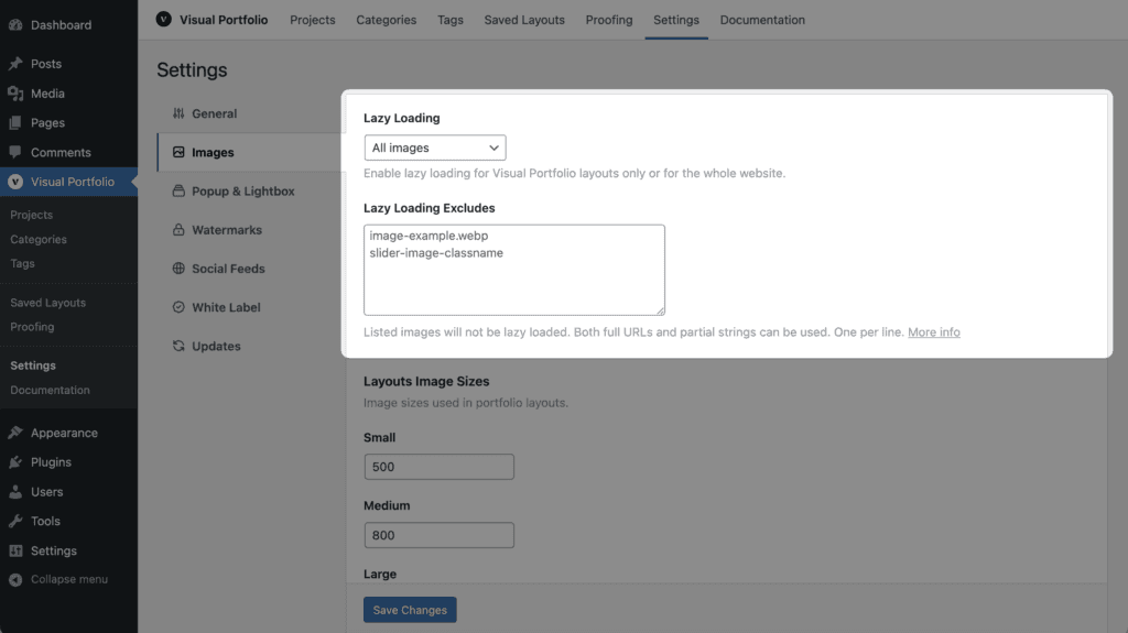
| Setting | Values | Default | Notes |
|---|---|---|---|
| Lazy Loading | Disabled, Visual Portfolio Only, All images | Visual Portfolio Only | Visual Portfolio Only lazy-loads gallery images. All images also processes post content, featured images, avatars, text widgets and WooCommerce product images |
| Lazy Loading Excludes | One string per line | empty | Images whose tag contains one of the strings are left alone: a file name, a class, an attribute, a domain |
How it works: images get a light placeholder of the same size and load when they approach the viewport (the lazysizes library). The browser’s native loading="lazy" is replaced, because layouts need the real size before the image loads. Images with fetchpriority="high" are never lazy-loaded, so the largest image of a page keeps its priority.
Images already handled by another lazy loader are skipped: those with the classes lazy, lazyload, lazy-load, skip-lazy, no-lazy, or attributes such as data-src, data-lazy-src, data-no-lazy, data-skip-lazy. Add the no-lazy class to any image to exclude it.
When EWWW Image Optimizer’s lazy load, Lazy Loader, SiteGround Optimizer’s lazy load, Avada’s or Enfold’s lazy load is active, the plugin’s lazy loading switches itself off. Jetpack, a3 Lazy Load, Imagify, WP Rocket (Delay JS) and Divi are handled without switching off. For other conflicts, set Lazy Loading to Disabled or disable the other lazy loader.
Excluding an image
For this image:
<img src="…/daniele-riggi-635135-unsplash.jpg" class="attachment-full size-full" data-imgsrc="…" alt="unsplash image" title="image title">any of these lines works: daniele-riggi-635135-unsplash.jpg, size-full, -unsplash, unsplash image, image title, data-imgsrc. A line with two classes (attachment-full size-full) matches only images that have both, in that order. Elementor image widgets put classes on a wrapper, not on the image; there, use the file name, or add the no-lazy class through the “Add Class to Elementor Image” plugin.
Layouts Image Sizes
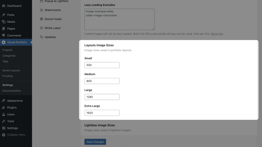
Four image sizes are registered for gallery items (width limits; height is unlimited, no cropping):
| Size | Default width | Used by |
|---|---|---|
| Small | 500 px | Available to themes and the REST API |
| Medium | 800 px | Available to themes and the REST API |
| Large | 1280 px | Tiles, Masonry and Grid with 4 or 5 columns |
| Extra Large | 1920 px | Every other layout and column count |
They appear in the media size dropdowns as “Small (VP)”, “Medium (VP)”, “Large (VP)”, “Extra Large (VP)”. The browser picks the smallest fitting file through srcset, so a 1920 px size does not mean a 1920 px download on a phone. Animated GIFs are always served at full size.
Lightbox Image Sizes
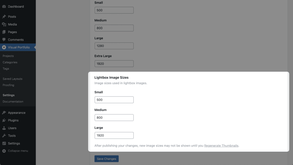
| Size | Default width |
|---|---|
| Small | 500 px |
| Medium | 800 px |
| Large | 1920 px |
The lightbox loads Large and falls back to Medium and Small on smaller screens.
After changing any size, regenerate thumbnails (the Regenerate Thumbnails plugin, or wp media regenerate), otherwise existing images keep their old sizes. Image optimization and WebP plugins (Imagify, EWWW, ShortPixel, LiteSpeed) work with these sizes.