
Table of Contents
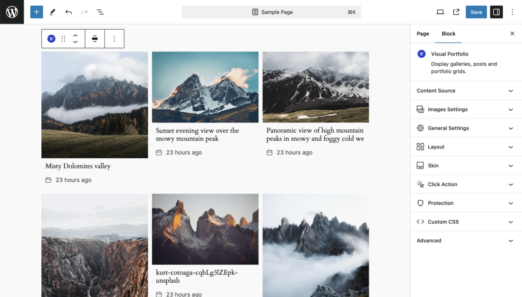
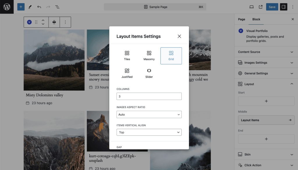
Items sit in equal columns and rows. All images in a row are the same height when a Media Aspect Ratio is set; with Auto, each row takes the height of its tallest item.
| Setting | Values | Default | Notes |
|---|---|---|---|
| Columns | 1 to 5 | 3 | |
| Media Aspect Ratio | Auto, Wide 16:9, Ultra Wide 21:9, TV 4:3, Classic Film 3:2, Custom | Auto | |
| Items Vertical Align (Pro) | Top, Center, Bottom | Top | Where shorter items sit in a row that has taller ones. Only matters with Auto aspect ratio or with captions of different lengths |
| Gap, Vertical Gap | 0 to 200 px | 15, empty |
Small screens
The same column ladder as Masonry: one column fewer at each breakpoint below the count you set. See Responsive behaviour.