
Table of Contents
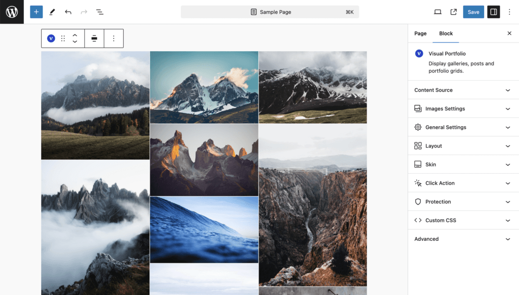
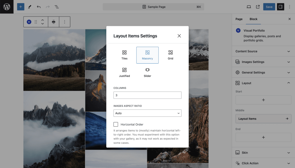
Items are placed in columns; each image keeps its own height, so columns fill up unevenly.
| Setting | Values | Default | Notes |
|---|---|---|---|
| Columns | 1 to 5 | 3 | |
| Media Aspect Ratio | Auto, Wide 16:9, Ultra Wide 21:9, TV 4:3, Classic Film 3:2, Custom (width and height numbers) | Auto | Auto keeps the original ratio of every image. Any other value crops all images to that ratio, which turns the masonry into an even grid |
| Horizontal Order | on / off | off | Tries to keep items in left-to-right order across the columns. The description in the panel warns that it does not always work as expected: an item that does not fit the next slot is placed where it fits |
| Gap, Vertical Gap | 0 to 200 px | 15, empty |
Four or five columns use the Large (VP) image size, one to three columns Extra Large (VP).
Small screens
| Columns set | Above 1200 px | 993 to 1200 px | 769 to 992 px | 577 to 768 px | 576 px and below |
|---|---|---|---|---|---|
| 5 | 5 | 4 | 3 | 2 | 1 |
| 4 | 4 | 4 | 3 | 2 | 1 |
| 3 | 3 | 3 | 3 | 2 | 1 |
| 2 | 2 | 2 | 2 | 2 | 1 |
| 1 | 1 | 1 | 1 | 1 | 1 |
The widths are the Responsive Breakpoints (Pro can change them in Settings → General). See Responsive behaviour. To force a different count with CSS, see the FAQ How to change the number of columns on mobile screens.