
Table of Contents
A gallery of images from the Media Library, managed inside the block.
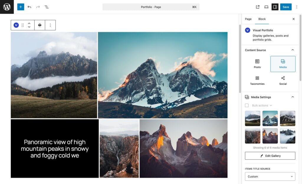
Pick images
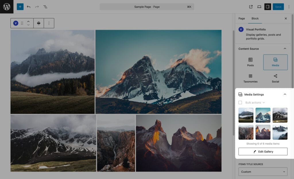
- Choose Media as the source.
- Click Add Media. Select images (Shift or Ctrl for several) or upload new ones, then Select.
- To add more later, click Edit Gallery.
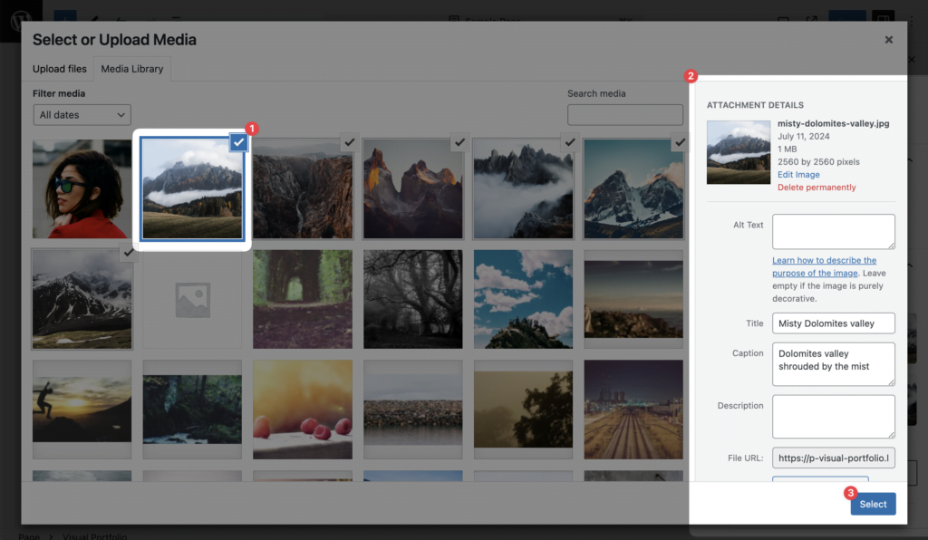
With Pro the picker also accepts video files (mp4, webm, ogg, ogv, mpeg, mpg, avi, mov, wmv, flv, mkv, m4v, 3gp, ts, mts, m2ts); see Video items below. Without Pro, only images can be picked; link a video with the Video format instead.
The attachment’s Title, Caption, Alt and Description in the Media Library can feed the gallery item (see Titles and descriptions).
The gallery list
Under the button the images are listed, 18 at a time (Show More, Show All), with:
- drag to reorder;
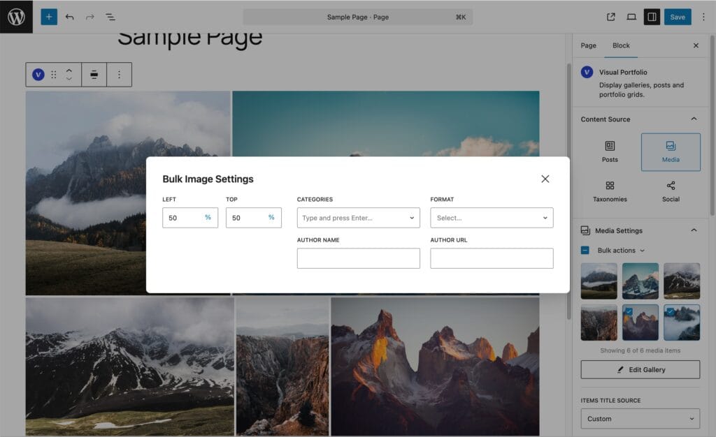
- Select All, then Bulk actions → Edit (opens the bulk settings) or Delete;
- Filter by Category to show only images of one category;
- a click on an image to open its Media Settings.
Media Settings of one image
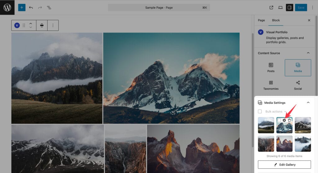
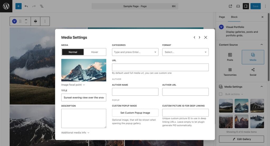
| Field | Plan | What it does |
|---|---|---|
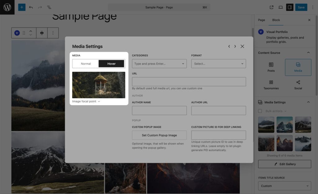
| Normal / Hover media toggle | Hover is Pro | Hover: an image or a local video shown while the pointer is over the item (see Hover media) |
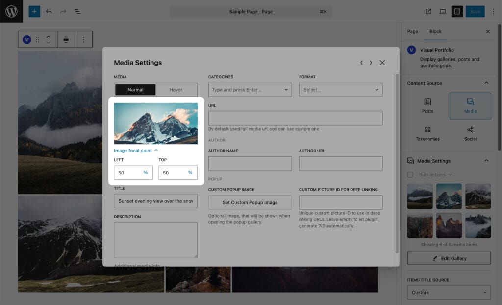
| Image focal point | Free | The part of the image that stays visible when the layout crops it |
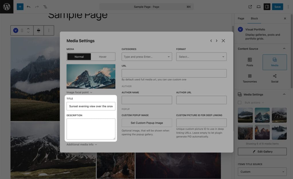
| Title | Free | The item title. Editable when Items Title Source is Custom; otherwise filled from the attachment and read-only |
| Alt | Free | Alt text for this gallery only. Empty keeps the Media Library alt |
| Description | Free | The item description; same rule as Title |
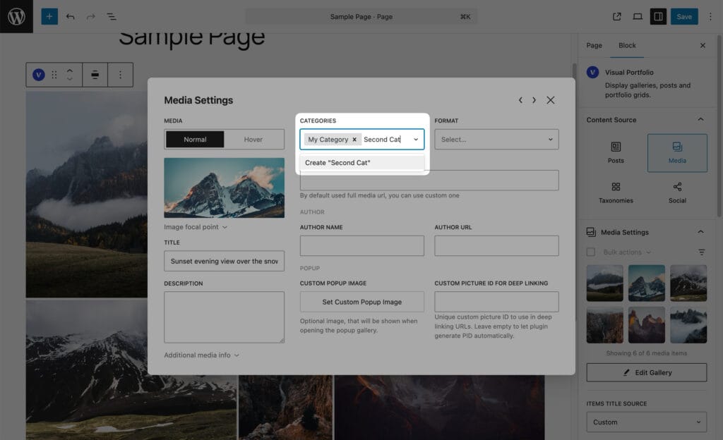
| Categories | Free | Free-text categories, used by the Filter and shown by Display Categories. Type a name and press Enter; names used on other images are suggested |
| Format | Free | Standard, Video; with Pro also Audio and Gallery |
| Video URL | Free | Shown for the Video format. YouTube or Vimeo; more vendors with Pro (see Project Formats) |
| Audio URL | Pro | Shown for the Audio format |
| Album Images | Pro | Shown for the Gallery format. The images this item opens in the lightbox |
| URL | Free | A custom link. Default is the full-size image file. Setting a URL turns the lightbox off for this image: it becomes a plain link |
| Author Name, Author URL | Free | Shown by Display Author in the skin |
| Playback, Cover Image | Pro | Shown for local video files (see Video items) |
| Custom Popup Image | Pro | An image shown in the lightbox instead of this one. Not for the Gallery format |
| Custom Picture ID for Deep Linking | Pro | The pid of this image in deep links (see Click Action) |
| Additional media info | Free | File name, type, size, dimensions, links to the file, the attachment page and the edit screen |
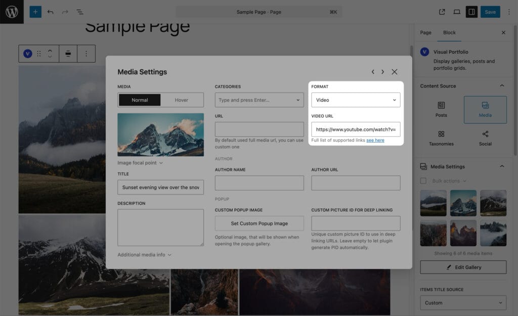
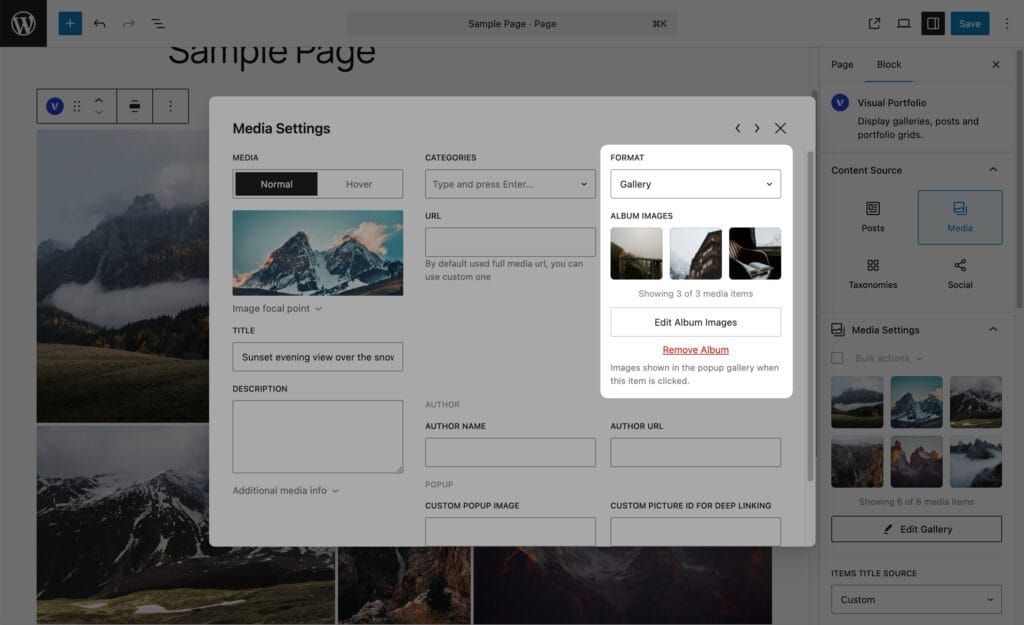
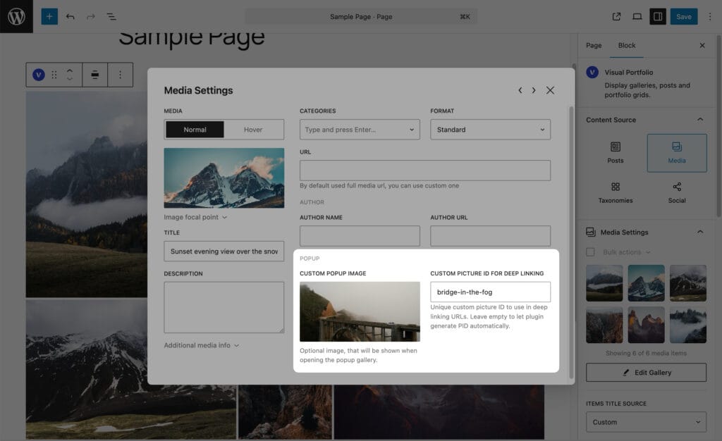
Bulk Image Settings (Select All → Bulk actions → Edit) sets the focal point, categories, format, author name and author URL on every selected image at once.
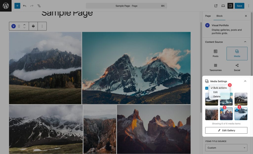
Video items (Pro)
A video file picked from the Media Library becomes a video that plays inside the grid item, with a play icon. Settings:
| Setting | Values | Default |
|---|---|---|
| Playback | Autoplay in Viewport (plays when at least half of it is visible, pauses otherwise, muted), Play on Hover | Autoplay in Viewport |
| Cover Image | An image shown before playback | The video’s own featured image, if any |
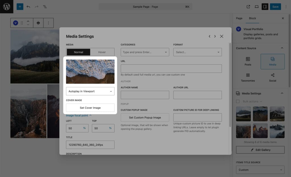
In the lightbox the item plays the Video URL if you set one, otherwise the file itself. With a custom URL the item links out and does not open the lightbox.
Hover media (Pro)
Switch the toggle at the top of Media Settings to Hover and pick an image or a local video. Images cross-fade on hover (animated GIFs restart), with their own focal point. Videos play on hover and pause when the pointer leaves. Hover needs a pointer; on touch screens the normal media is shown.
Albums (Pro)
Set the Format to Gallery and pick Album Images. The item shows a stacked-images icon (Display Gallery Icon in the skin) and, optionally, “N Images” (Display Images Count). Clicking it opens the album in the lightbox. See Albums.
Titles and descriptions
| Setting | Values | Default |
|---|---|---|
| Items Title Source | None, Custom, Image Title, Image Caption, Image Alt, Image Description | Custom |
| Items Description Source | Same | Custom |
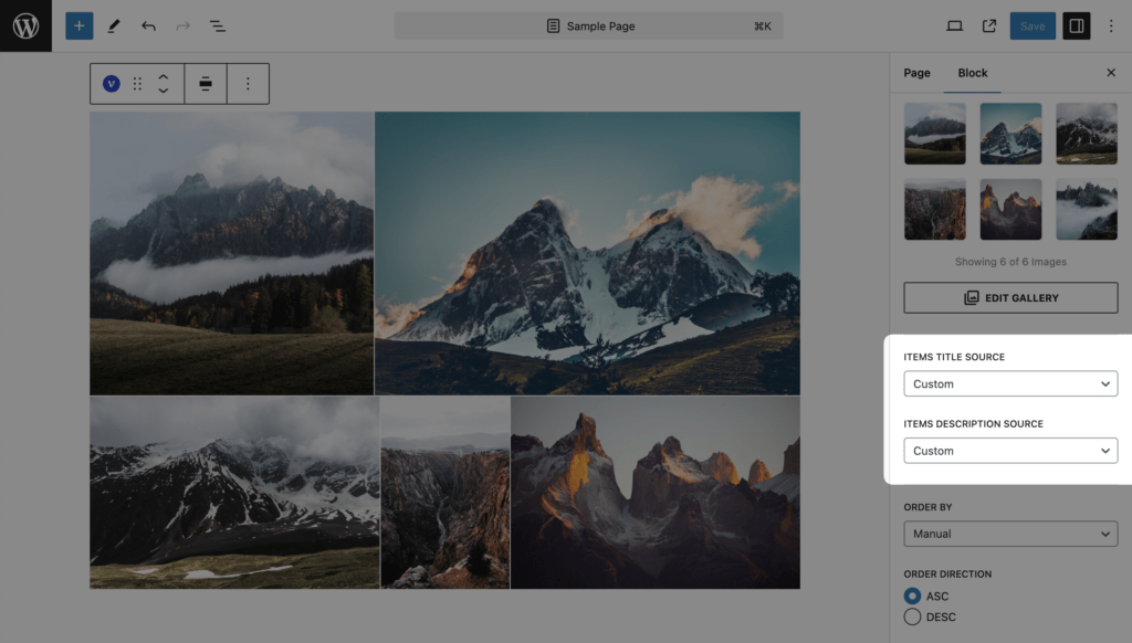
Custom uses the Title and Description typed in Media Settings. The Image values are read from the attachment at render time, so editing them in the Media Library updates every gallery. A deleted attachment yields an empty text.
Order
| Setting | Values | Default |
|---|---|---|
| Order by | Manual, Item Title, Item Description, Image Title, Image Caption, Image Alt, Image Description, Image Uploaded, Random | Manual |
| Order Direction | ASC, DESC | ASC |
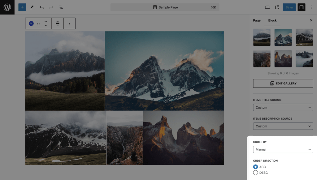
Items with an empty sort field go last. Random keeps the same order for a visitor across pages.
Size and performance
Galleries use the Small, Medium, Large and Extra Large (VP) image sizes from Settings → Images, chosen per layout; the lightbox uses its own sizes. Large galleries: set Items Per Page below 40 and add Load More or Infinite pagination, as the editor warning suggests.