A grid gallery with photos centered vertically in each row. The Items Vertical Align setting splits the spare height instead of cropping to one ratio.

New Motorcycle Sport
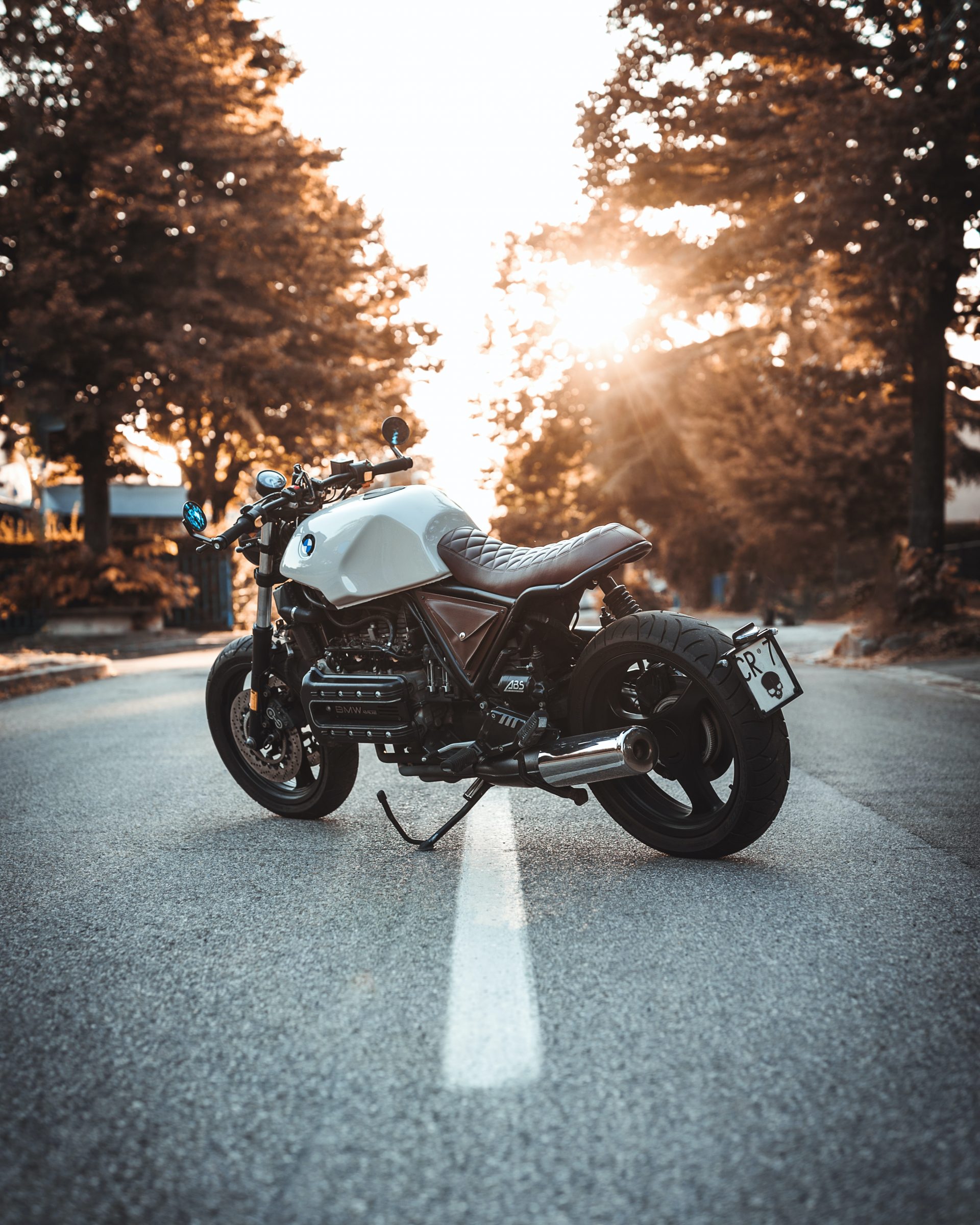
Electric Dream
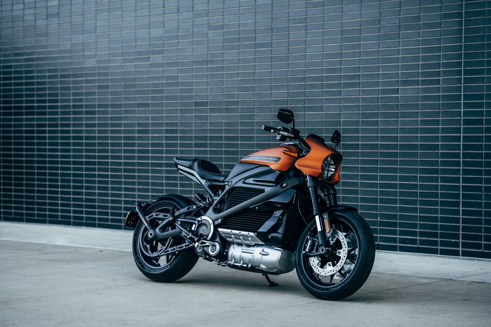
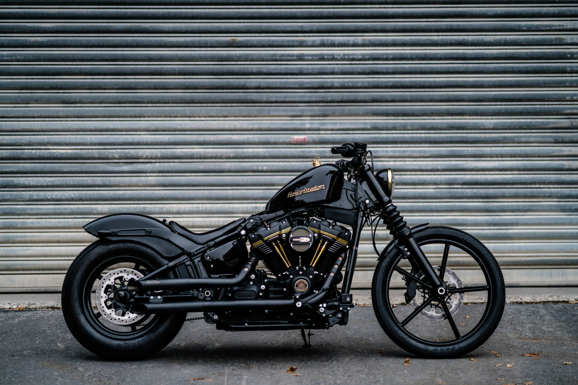
Custom Street Bike
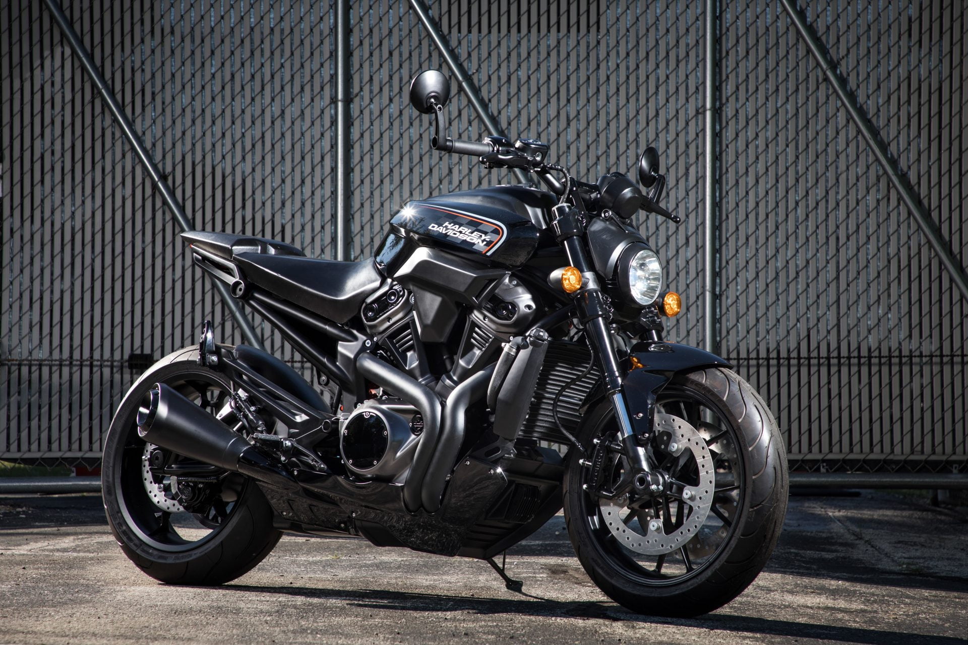
Ride With Confidence
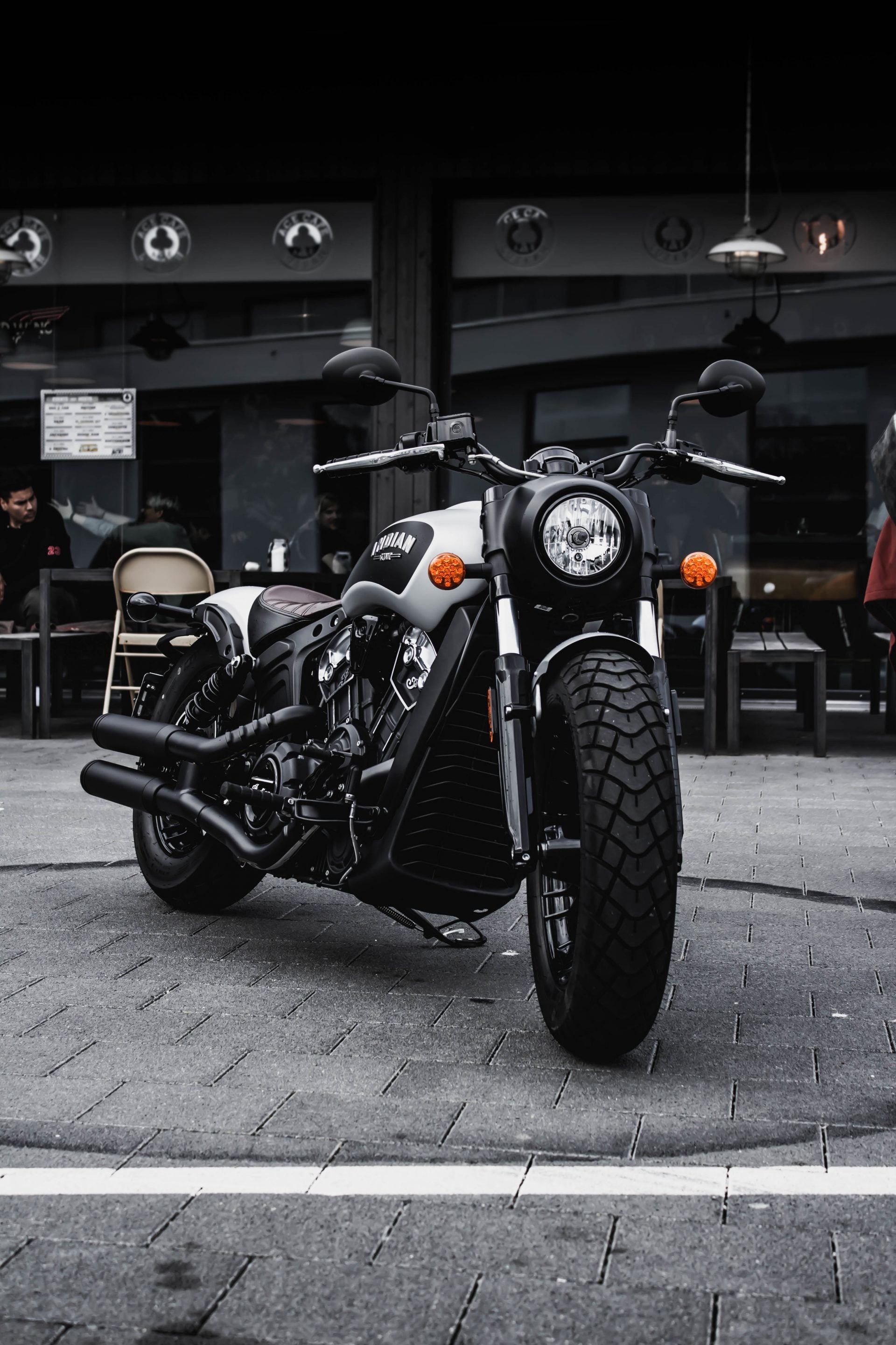
Touring Beast

Your Thunder Dude
What Items Vertical Align does in a row
A grid puts every item in a cell of the same width. With Media Aspect Ratio left on Auto, a row is as tall as its tallest picture, and the shorter ones leave empty space under them. Items Vertical Align decides where that space goes. Top is the default. Bottom drops the short items to a shared baseline, and Center splits the leftover height so the row reads as one band.
The other way to even out a row is to crop it. Any Media Aspect Ratio other than Auto gives every image in the row one height, which leaves nothing to align. That suits product shots and screenshots. It is wrong for photography, where the frame is part of the picture. A masonry gallery solves the same problem from the other side, dropping rows entirely so each image keeps its own height, at the cost of a ragged bottom edge.
What the Grid panel accepts
Vertical Align is a Pro control in the Grid layout panel. The free settings around it decide whether it has anything to do.
- Columns run 1 to 5 and default to 3. This page uses 2.
- Items Vertical Align takes Top, Center or Bottom and starts on Top. It does nothing unless the aspect ratio is Auto, or the captions run to different lengths.
- Media Aspect Ratio offers Auto, Wide 16:9, Ultra Wide 21:9, TV 4:3, Classic Film 3:2 and Custom. Auto is the default, and the only one that leaves a row uneven.
- Gap and Vertical Gap both accept 0 to 200 px. Gap starts at 15. Vertical Gap starts empty, and an empty Vertical Gap copies Gap.
- Overlay padding on the Fade skin starts at 2em.
- Threshold Distance sets how far from the bottom infinite scroll fires. It is a Pro field, 10 to 800 px, 400 by default.
Centering a row in three steps
- Add the Visual Portfolio block and choose Media as the content source. Click Add Media, pick pictures of different proportions, then type a category into each image’s settings so the dropdown filter has something to list.
- Open Layout, pick Grid, set Columns to 2 and leave Media Aspect Ratio on Auto. Set Items Vertical Align to Center. The preview reflows without reloading.
- Choose the Fade skin, set Click Action to Popup, then open Pagination and set Type to Infinite. The editor preview still draws a Load More button there.
Vertical Align sits behind the license
Grid layout, the column count, the Auto ratio, the Fade skin, the dropdown filter, infinite scroll and the popup all ship in the free plugin on WordPress.org. Pro is a separate download that already contains the free plugin, so there is nothing to stack. The full split is in the free versus Pro table, and the tiers are on the pricing page. Five of the settings behind this page need a license key.
- Items Vertical Align itself. Center is the value this demo runs on.
- Image transform for the normal and the hover state. The hover here is scale(1.05) with a 2 percent nudge sideways.
- Responsive Breakpoints, if 576 px is not where your theme wants the grid to fall to one column.
- Threshold Distance, and the options that make infinite scroll wait for a first click or pause for a button every few pages.
- Load Next Pages, which pulls the following page into the lightbox while the visitor browses. The counter then reads N plus.
Questions about mixed-height grids
Why did my photos get cropped when I set a ratio?
Grid and Masonry crop as soon as Media Aspect Ratio is anything but Auto, and Tiles always crops to the tile shape. Vertical Align then goes quiet, because a row of equal heights has no space left to move. The cropping FAQ lists which layout crops when. Set the image’s focal point in Media Settings to choose what survives.
How do I keep two columns on a phone?
A two column grid holds both columns down to 577 px and shows one at 576 px and below. The column count FAQ carries the media query that keeps the pair, a rule setting the item wrap width to 50 percent. Pro moves the breakpoint itself, under Settings, General, Responsive Breakpoints.
Can I choose which images share a row?
Rows fill left to right in gallery order, so the sequence decides which heights get centered against each other. Two tall pictures side by side make a tall row. Reordering is a drag in the gallery list under the Add Media button, with Order by left on Manual, the default. Switch Order by to title, caption, upload date or random, and the pairing is decided for you.