A WordPress justified gallery in full-width 350 px rows. Pick it over masonry when a straight bottom edge matters more than uncropped photos.

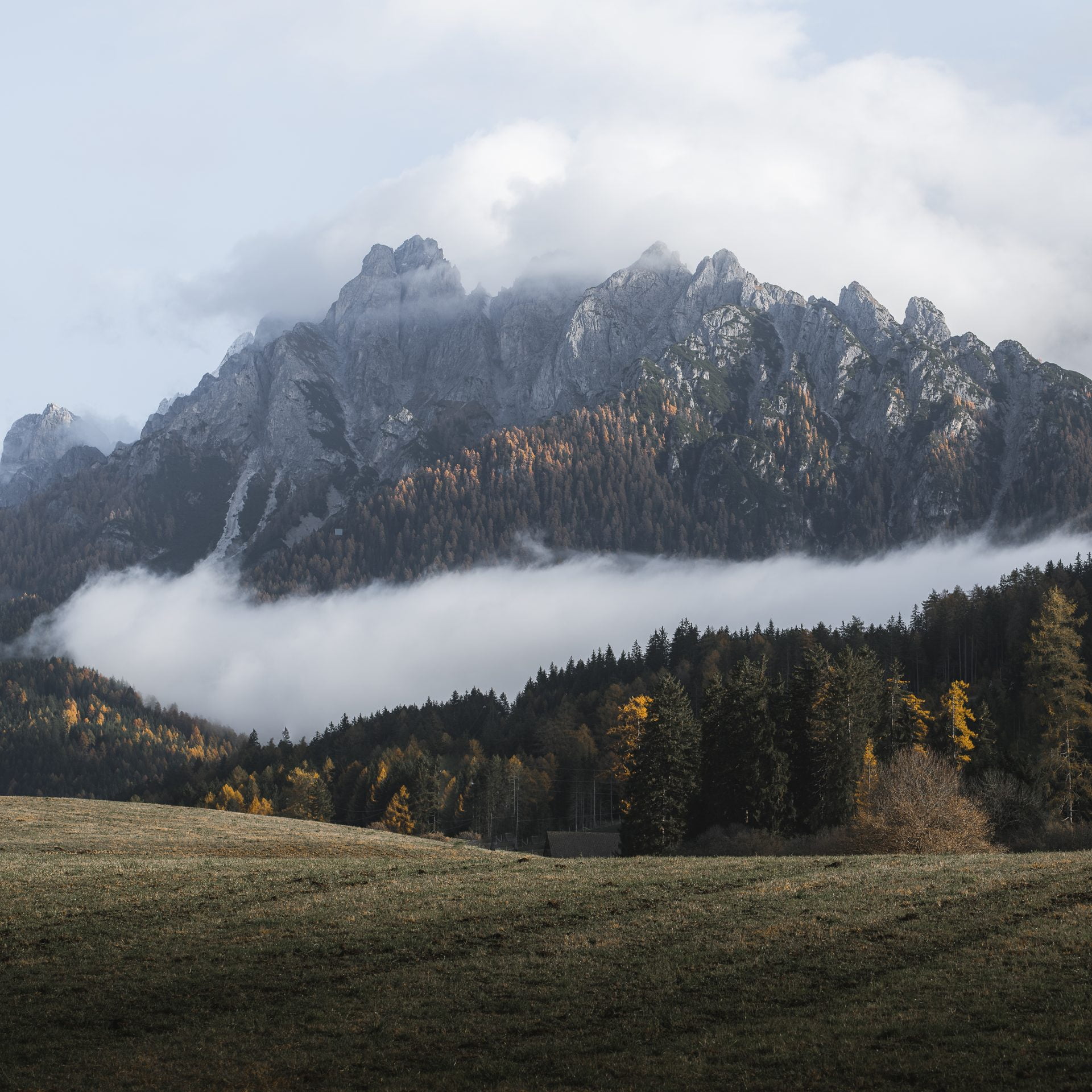
Misty Dolomites valley
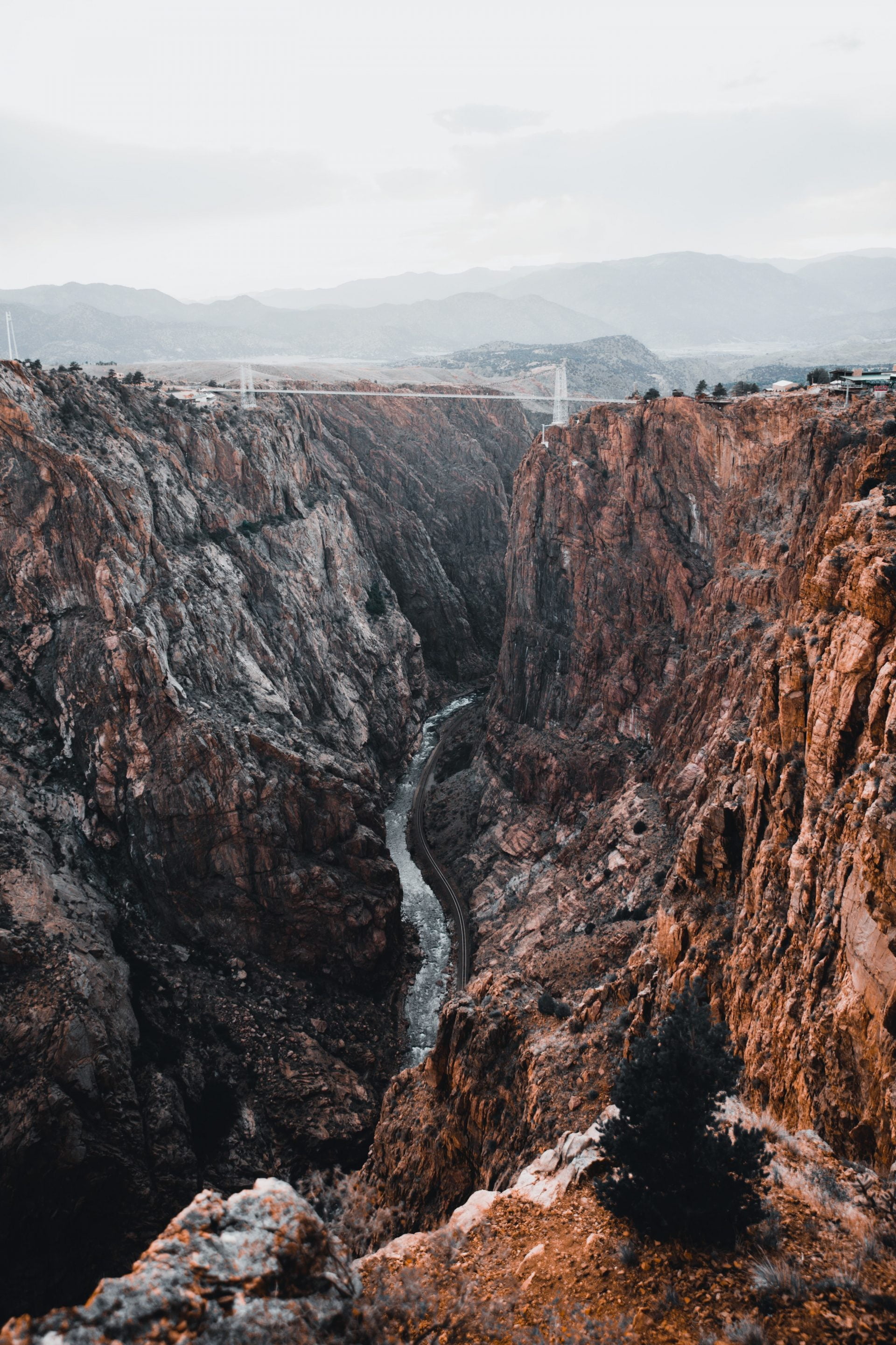
Black Canyon of the Gunnison National Park
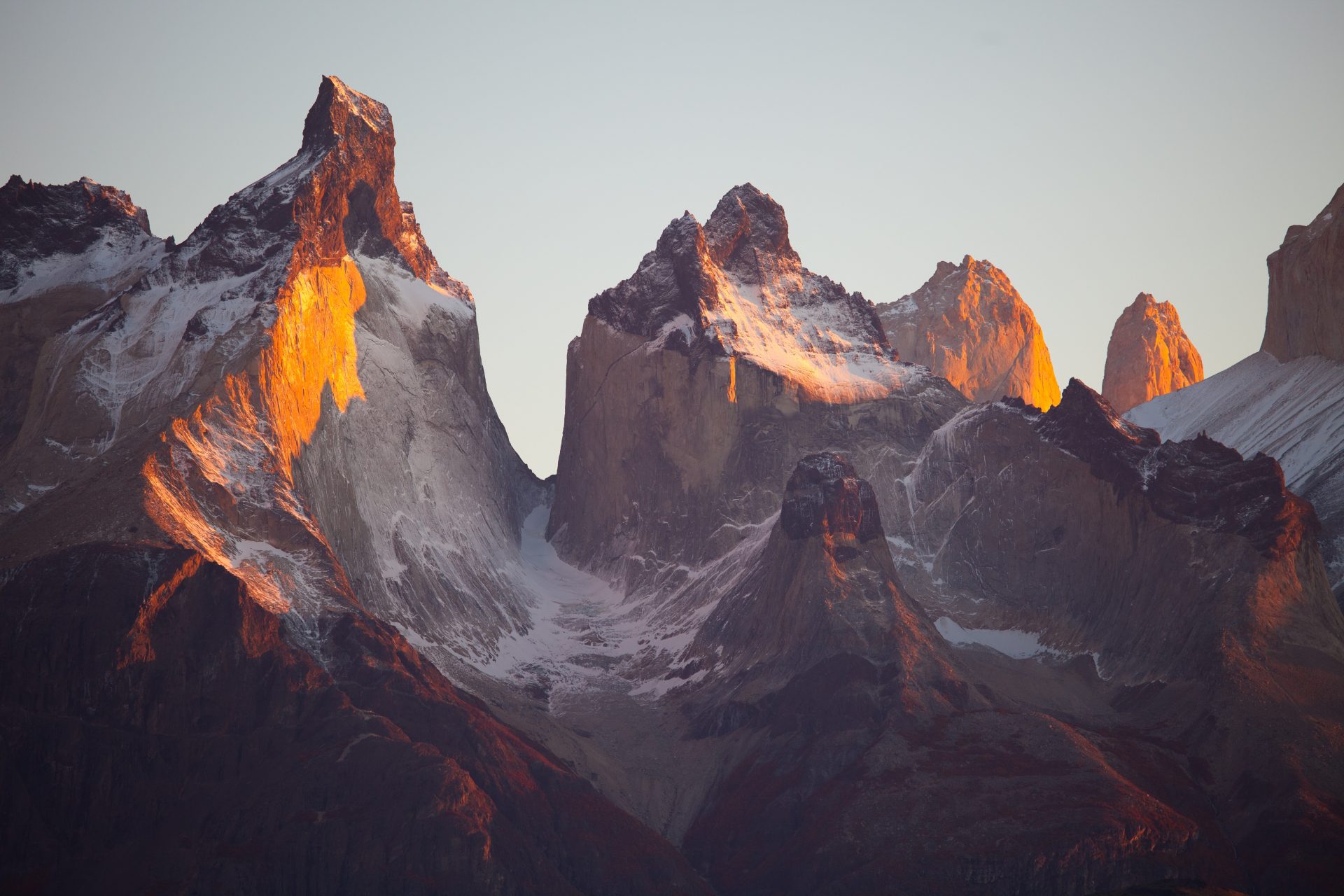
Torres del Paine National Park, Chile
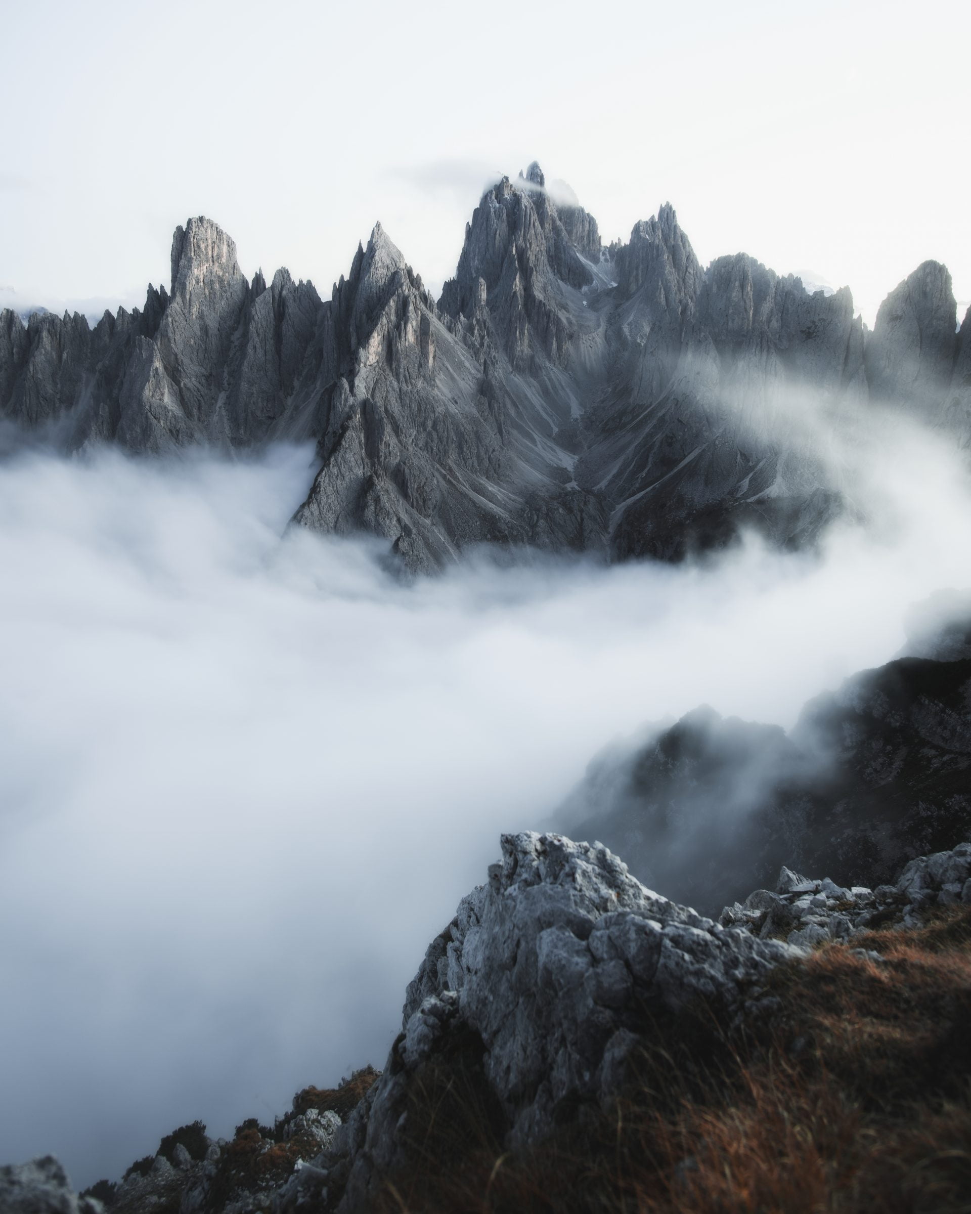
Cadini di Misurina
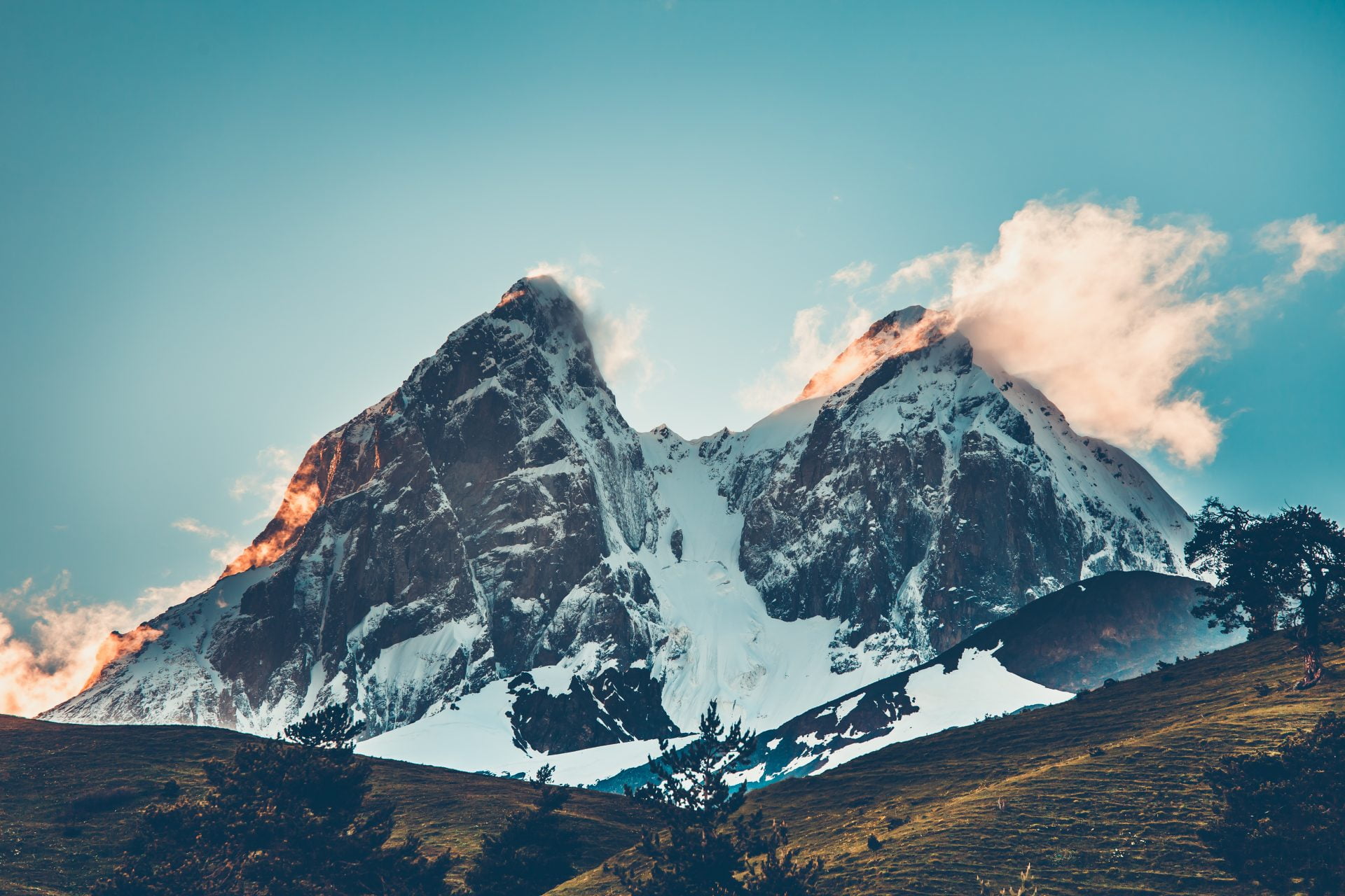
Sunset evening view over the snowy mountain peak
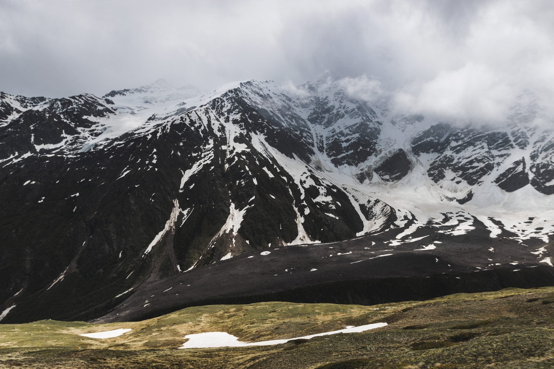
Panoramic view of high mountain peaks in snowy and foggy cold day
What a justified gallery does
Every row reaches the full width of the block, and the images in that row are scaled to one shared height. A panorama comes out wider than the portrait beside it, and the two still line up top and bottom. There is no column setting here. You give the layout a target row height, and how many images land in a row follows from that. The library underneath is flickr-justified-gallery, hence the Flickr look.
The alternative is masonry, which fills columns rather than rows. Nothing is scaled to match a neighbour there, so proportions stay exact, but the columns finish at different heights and the foot of the gallery is ragged. Pick justified when that straight bottom edge matters more than keeping every photo uncropped. On a phone, masonry and grid drop one column at each breakpoint, while a justified gallery holds the row height you set and fits fewer images into each row.
Settings that shape the rows
All of this lives in Block settings, under Layout, once Justified is selected. Every value below is in the table on the justified layout page.
- Row Height takes 20 to 1000 px and defaults to 200. It is a target, and rows come as close to it as they can. The gallery above runs at 350.
- Row Height Tolerance runs 0 to 1 in steps of 0.05, default 0.25. At that setting a 200 px target gives rows between 150 and 250 px. Higher values fit images with less cropping, and 0 forces exact rows.
- Max Rows Count runs 0 to 50, and the default 0 shows every row. Two or three make a teaser that links to the full set.
- Last Row Align is Left, Center, Right or Hide, default Left. Hide leaves an incomplete last row out instead of showing a short one.
- Gap defaults to 15 px, Vertical Gap is empty, and empty means the same as Gap. Both take 0 to 200 px.
- Items come from the Media Library, or from posts and custom post types. Pro adds taxonomy terms and social feeds.
Building one in three steps
- Insert the Visual Portfolio block and choose Media as the source. Click Add Media, pick the images and press Select. They are listed under the button, eighteen at a time, and drag into order.
- Open Layout, choose Justified and set Row Height. Around 350 suits a full width photography page, 200 to 250 a narrower column. Raise Row Height Tolerance if the rows trim more off the images than you like.
- Under Layout Elements, put Filter in the top row and set its Style to Dropdown, then add Pagination to the bottom row. Set Click Action to Popup as well, or a click opens the full-size image file.
Free plugin or Pro
The justified layout is free. Every setting in the list above ships in the free plugin on WordPress.org, along with the category filter, paged pagination and the lightbox. Pro is a separate download that carries the free plugin inside it, and adds effects and extra content sources on top of the same layout. The free versus Pro comparison lists the split, and the licences are on the pricing page.
- Image filters, blend modes and transforms, set separately for the normal and the hover state.
- The tilt hover effect, and hover media, an image or local video shown while the pointer is over an item.
- Taxonomy and social feed sources, so justified rows can be filled from Instagram, Flickr or Unsplash.
- Responsive Breakpoints, editable in Settings, and deep linking, which gives every lightbox slide its own address.
Questions we get
Why are my images cropped?
Justified trims a little so the rows come out even, and Row Height Tolerance decides how much. The focal point on each image, set in its Media Settings, chooses what stays in frame. Heavier cropping comes from the other layouts, and the cropping FAQ says which and when.
How many images can one gallery hold?
There is no hard limit. Past 40 items on one page the editor warns that the page will load slower, so keep Items Per Page at 40 or below and add Load More or Infinite pagination. More on that in how many images a gallery can hold.
Why do the photos look blurry?
Most layouts serve the Extra Large (VP) size at 1920 px, and the browser picks a smaller file for a smaller screen. Nothing is scaled up past the file you uploaded, so a 900 px original goes soft in a 350 px row on a wide monitor. Upload at least 1920 px wide. If the photos were uploaded before the plugin was installed, regenerate the thumbnails, as the blurry images FAQ explains.