
Table of Contents
Block settings → Skin. A skin decides how one item looks: where the image sits, what is drawn over it on hover (the overlay), and what is written under it (the caption).
Available skins
| Skin | What it does | Text placement |
|---|---|---|
| Classic | Enlarges the image slightly on hover; an icon can appear over it | Caption under the image |
| Fade (default for new blocks) | The image fades into the overlay color on hover; the text sits on the overlay | Overlay |
| Fly | The overlay slides in from the side the pointer came from | Overlay |
| Emerge | A caption panel rises from the bottom edge on hover; the image lifts | Caption over the bottom of the image, plus an overlay tint |
| Caption Move (Pro) | The caption follows the pointer as a floating box | Floating caption, plus an overlay |
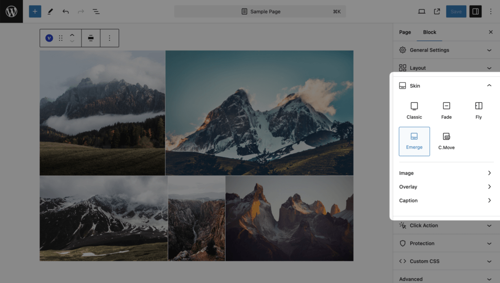
Every skin keeps its own settings. Switching from Fade to Emerge starts from Emerge’s defaults; the Fade values stay stored and come back when you switch back.
Settings tabs
Settings are grouped in tabs inside the Skin panel: Image, Overlay, Caption. A tab is hidden when the skin has nothing in it (Fade and Fly have no Caption tab). Inside Overlay and Caption, the settings are folded into Elements, Colors, Typography (Pro) and Dimensions (Pro).
For the full list of settings and defaults see Skin settings reference.
Hover and touch screens
Hover effects of every skin are pointer events. On touch screens there is no hover; use Move Overlay Under Image (Pro) or the Display: Always option so the text is visible without hovering.